Data Visualization Best Practices: Tell Stories with Data
Create compelling and accurate data visualizations using Python, Tableau, and Power BI that drive better decision-making.
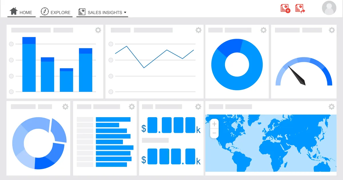
A great visualization turns a confusing spreadsheet into an instant insight, while a poor one misleads or bores its audience. Data visualization is as much about communication and honesty as it is about charts.
This guide covers the principles and best practices that help you tell clear, accurate stories with data.
Why Data Visualization Guide Matters in Practice
data visualization is easiest to understand when it is treated as a working system rather than a collection of fashionable terms. The important question is not whether the technology sounds advanced, but whether it changes how people make decisions, move information, or complete a task. For analysts, journalists, researchers, and product teams, that means starting with the problem, identifying the people affected by it, and defining what a useful result would look like before choosing tools. The useful outcome is a graphic that helps its intended audience answer a defined question without distorting uncertainty or scale.
That problem-first view also prevents a common mistake: evaluating a technology only through a polished demonstration. Demonstrations hide integration work, maintenance, governance, unusual inputs, and the moments when a human must intervene. A production system has to survive all of those conditions. It needs a clear owner, observable behavior, understandable failure modes, and an exit path if the approach stops serving its purpose. Those operational details are where most of the lasting value—and most of the risk—actually lives.
Start With the Message
Before choosing a chart, decide what single point you want the viewer to take away. A visualization should make that message obvious at a glance. When you lead with the message rather than the data, every design choice becomes easier and more purposeful.
Choosing the Right Chart
- Use bar charts to compare quantities across categories.
- Use line charts to show trends over time.
- Use scatter plots to reveal relationships between two variables.
- Avoid pie charts for anything beyond a couple of slices.
Match the chart to the question
The right chart is the one that answers the viewer's question with the least effort. When in doubt, a simple bar or line chart usually communicates more clearly than a fancy alternative.
Designing for Clarity
Remove clutter, label directly, use color with intent rather than decoration, and ensure adequate contrast for accessibility. Every element that does not serve the message is noise that weakens it.
Visualizing Honestly
Start bar chart axes at zero, avoid distorting scales, and never cherry-pick ranges that mislead. A visualization carries authority, and with that comes a responsibility to represent the data truthfully.
From First Input to Useful Output
A reliable implementation can be described as a chain of small responsibilities. An author identifies the audience and message, verifies the underlying data, chooses an encoding suited to the comparison, removes distractions, labels context directly, tests accessibility, and reviews whether the finished chart supports an honest interpretation. Each stage should have a defined input, a defined output, and a way to detect when the result is incomplete or suspicious. This sounds elementary, but it is one of the clearest differences between a tutorial and a system that another person can operate. When responsibilities are blurred, a defect in one stage quietly contaminates every stage after it.
Good teams therefore document the path a piece of information takes, including where it originates, how it is transformed, who can change it, and how long it is retained. They also record the assumptions embedded in that path. If an input is late, duplicated, malformed, adversarial, or simply different from the examples used during development, the system should fail visibly rather than produce a confident-looking result. Small validation checks placed at boundaries are usually more valuable than a single complicated check at the end.
The workflow should remain understandable to someone who did not build the first version. Names, interfaces, logs, and documentation are not administrative extras; they are part of the design. A new maintainer ought to be able to trace a representative case from beginning to end and explain why the system produced its output. If that explanation depends on one person's memory, the project has accumulated operational debt even when the software still appears to work.
The Design Decisions That Shape the Result
Visualization design balances chart form, scale, ordering, aggregation, annotation, color, density, interaction, and the amount of surrounding explanation the audience needs. These choices are connected. Optimizing one metric in isolation can make the complete system worse: lower latency may reduce verification, greater flexibility may weaken consistency, and extra automation may remove the pause in which a person would notice a bad assumption. A decision record should state the chosen trade-off, the rejected alternatives, and the evidence that would justify revisiting it.
Scale should be measured in the dimensions that actually stress the system. That might be request volume, data variety, number of devices, transaction contention, model size, geographic distance, or the number of people who need to coordinate. "Scalable" is not a useful requirement by itself. A better requirement names an expected load, an acceptable response, and the cost ceiling within which both should hold. This turns architecture discussion from taste into something that can be tested.
Simplicity deserves deliberate weight. A familiar component with clear failure behavior often beats a sophisticated component whose advantages do not address the workload. The simpler choice is easier to secure, monitor, explain, and replace. Complexity is justified when measurement shows that it solves a real constraint, not when it merely makes a diagram look more modern. This principle is especially important for analysts, journalists, researchers, and product teams, who may inherit decisions long after the original excitement has passed.
- Write down the user or operational problem before comparing technologies.
- Choose measurable constraints for performance, reliability, cost, and privacy.
- Prefer components whose failure modes the team can explain and rehearse.
- Review the decision when the workload or evidence changes, not on a fixed hype cycle.
A Responsible Implementation Roadmap
The safest first step is a deliberately narrow pilot. Pick one representative workflow, define a baseline using the current method, and decide in advance what improvement would make the experiment worthwhile. The pilot should include ordinary cases and uncomfortable edge cases. It should also include the cost of human review, integration, security work, and ongoing operation; excluding those items creates an unrealistically flattering comparison.
- Describe the current process and the outcome that data visualization is expected to improve.
- Collect representative examples, including missing, delayed, unusual, and hostile inputs.
- Build the smallest end-to-end path that can be observed rather than a disconnected demonstration.
- Measure quality, latency, cost, accessibility, and recovery against the original baseline.
- Ask an independent reviewer to challenge assumptions and attempt common failure scenarios.
- Expand scope only after ownership, monitoring, documentation, and rollback are in place.
A pilot is successful when it produces trustworthy evidence, not merely when it produces a positive result. Discovering that an approach is too expensive, too fragile, or poorly matched to users is valuable because the discovery arrived before a broad deployment. Conversely, a promising pilot is only permission to test the next level of complexity. It is not proof that every team, region, or workload will behave the same way.

Security, Privacy, and Governance
Truncated axes, cherry-picked intervals, inappropriate aggregation, inaccessible color, decorative clutter, overplotting, and omitted uncertainty can make accurate numbers communicate a false conclusion. Security begins with an inventory: what information enters the system, which identities and services can reach it, what authority each component has, and where outputs are sent. Least privilege, strong authentication, encrypted transport, maintained dependencies, and useful audit records remain the foundation. New technology does not make these controls obsolete; it usually creates more places where they must be applied consistently.
Privacy requires separate attention because a technically secure system can still collect too much or retain it too long. Teams should minimize inputs, state a retention period, separate sensitive identifiers where practical, and provide a process for correction or deletion when applicable. Legal duties differ by context and region, so an article cannot substitute for professional review. The durable engineering lesson is to avoid collecting information that the workflow does not need.
Governance should name decision owners and escalation paths. Someone must be able to pause an automated process, investigate an anomalous output, communicate an incident, and authorize recovery. Logs should support that work without becoming a second uncontrolled store of sensitive material. Regular review matters because permissions, dependencies, participants, and threats change after launch. A design that was reasonable at the beginning can quietly become unsafe if nobody revisits its assumptions.
A practical control
For every automated or irreversible action, define who can stop it, how the action is reconstructed from evidence, and what a safe rollback looks like before launch.
How to Measure and Maintain the System
Measurement should connect technical behavior to the experience that motivated the project. Availability and response time matter, but so do correctness, completion rate, manual rework, accessibility, user trust, and total operating cost. Averages can conceal the very cases that need attention, so teams should examine distributions and meaningful segments. A system that is fast for most users but consistently fails for one environment is not well described by a good average.
Monitoring must lead to an action. Each alert needs an owner, a threshold with a reason behind it, and a response that can be performed under pressure. Too many low-value alerts train people to ignore the channel, while missing context forces responders to reconstruct events during an incident. Start with a small set of signals tied to user harm, then add detail only when it changes diagnosis or response.
Maintenance includes dependency updates, security review, data or protocol changes, documentation, cost review, and periodic recovery exercises. Practice by redesigning one chart for three audiences, then conduct a short comprehension test to learn what each reader notices and misunderstands. Schedule that work as part of the product rather than hoping it fits between feature requests. The long-term question is not whether the first release worked; it is whether the system can remain understandable and recoverable while its environment changes.
Common Mistakes and Better Alternatives
Starting with a tool instead of a constraint
A team can spend weeks proving that a tool functions and still learn nothing about whether it improves the intended work. Begin with a baseline and a measurable constraint. This keeps the evaluation open to a simpler solution and makes a negative finding useful rather than embarrassing.
Treating the happy path as the whole product
Real inputs arrive late, incomplete, duplicated, differently formatted, or deliberately manipulated. Test those cases early. Define what the user sees, what is logged, and who is notified. Graceful failure is a product capability, not a final layer of polish.
Confusing deployment with completion
A launch begins the period in which evidence becomes representative. Review outcomes, operating effort, incident patterns, and changing assumptions. Retire components that no longer earn their complexity. Documentation and recovery drills are signals that a system is owned; their absence is a warning even when dashboards look healthy.
Who Should—and Should Not—Use data visualization
Data Visualization Guide is a strong area to explore when its defining properties match a specific constraint and the organization can support the operational work. It is particularly useful for learners who want to understand the underlying ideas, practitioners comparing architectures, and teams running a bounded experiment with representative evidence. The best candidates have a clear outcome, a responsible owner, and enough time to test behavior outside the ideal demonstration.
It is a weaker choice when a familiar method already meets the requirement, when the team cannot maintain the additional components, or when failure would cause harm that the available controls cannot contain. It may also be premature when data ownership, device inventory, identity, basic monitoring, or decision authority remains unresolved. Solving those foundations first often improves the current system and makes any later adoption safer.
There is no contradiction in learning an important technology while deciding not to deploy it. Understanding enables better boundaries, procurement questions, threat models, and future choices. A mature evaluation can end with adoption, a smaller pilot, a conventional alternative, or a deliberate pause. What matters is that the conclusion follows evidence and stated priorities rather than pressure to appear current.
Data Visualization Guide: Frequently Asked Questions
Which chart should I use first?
Start from the comparison: bars for quantities across categories, lines for ordered change over time, scatter plots for relationships, and tables when exact lookup matters more than pattern recognition.
Must every axis begin at zero?
Bar lengths normally need a zero baseline because viewers compare their physical length. Line charts can use a narrower range when it is clearly labeled and the choice does not exaggerate the story.
How many colors should a chart use?
Use neutral colors for context and one or a few deliberate highlights. Categories need distinguishable and accessible colors, but every additional hue adds decoding work and may imply a distinction.
How do I show uncertainty?
Depending on the analysis, use intervals, distributions, ranges, scenario bands, or explicit sample information. Explain what the uncertainty represents rather than presenting a decorative shaded region without definition.
Official Documentation and Further Reading
Primary documentation is the best place to confirm behavior that can change between releases. Read the relevant specification or project documentation, note the version it describes, and test important behavior in your own environment. The following starting points were selected for their direct connection to data visualization; they are not endorsements of a product or a promise of a particular outcome.
Key takeaways
- Decide your core message before designing anything.
- Match the chart type to the question being asked.
- Simple bar and line charts communicate most clearly.
- Remove clutter and use color with intent.
- Represent data honestly with truthful scales and ranges.
More in Data Science
Browse Data Science